Role
Brand Designer
Timeline
2025
Tools
Procreate, Adobe Illustrator
Brand Designer
2025
Procreate, Adobe Illustrator
Through the questionnaire and founder interviews, it became clear that every audience segment—coaches, parents, players, and administrators—shared the same frustrations: scattered communication, disorganization, and a lack of reliable tools. In a landscape dominated by broad, sport-agnostic platforms like TeamLinkt and TeamSnap, VOS stood out as the only volleyball-specific solution. The challenge wasn’t competing with another product—it was overcoming apathy and convincing clubs to adopt something new.
The discovery work also clarified the brand’s core identity: efficient, lean, and modern, with a premium feel that reflects the quality of the software. Clean sans-serif type, a blue-and-white palette, and a digital-friendly icon were all priorities, along with a personality that balances professionalism with a confident, slightly playful edge. This direction established the foundation for a brand that is tech-first, volleyball-informed, and built for clarity, credibility, and future growth.
From the discovery phase, the design strategy became clear:
Position VOS as tech-first, volleyball-second.
Build a premium identity grounded in clarity and simplicity.
Reflect volleyball in subtle, intelligent ways—not literal illustrations.
Use structure, spacing, and geometry to signal credibility and precision.
Four visual directions were explored:
Premium — high-end minimalism
Tech-Forward — electric, digital, system-driven
Energetic — motion, contrast, confidence
Fresh + Youthful — clean, modern, approachable
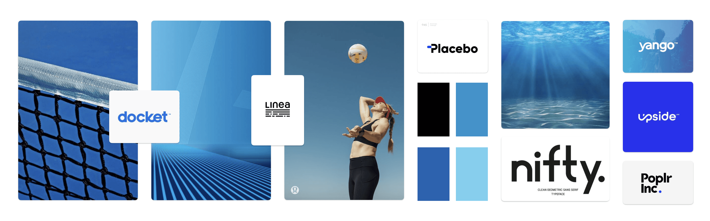
The fourth direction was selected, offering a balanced, contemporary identity suitable for both administrators and younger athletes.
Over 50+ sketches explored how volleyball and technology could merge through:
abstract geometric volleyball shapes
modular icon systems
sport-tech hybrid forms
explorations integrated into the letter “O”
a flipped-Azure-inspired “V”
standalone icons for favicons and app use
The final logo embeds an abstract, software-inspired volleyball into the “O”. Its geometry conveys:
the sport, without relying on literal illustration
movement and forward progress
the precision of a modern technology product
This mark scales cleanly across all digital applications, including favicon, mobile app icon, dashboards, and promotional materials.
I established a brand system that supports clarity and consistency across VOS’s growing product ecosystem:
logo and icon usage rules
clear-space and scaling guidelines
colour palette featuring the founder’s meaningful blue
modern, readable typography hierarchy
accessibility and contrast guidance
real-world mockups across marketing touchpoints
The final identity positions VOS as a premium, credible, volleyball-specific software company—modern enough to sit alongside major tech brands, yet focused enough to resonate deeply within the volleyball community. This system also lays the groundwork for VOS’s growth into training, curriculum, coaching tools, and more, providing a flexible visual language that can scale with the product’s long-term vision.
Below are applied brand assets—including lineup sheets, scoresheets, roster stickers, and course video graphics—created for VOS Academy. These were designed during my continued work with VOS Solutions Inc. as their in-house designer following the brand identity engagement.


